Polar charts, Radar charts
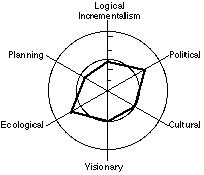
Polar, or `Radar' charts are a form of graph that allows a visual comparison between several quantitative or qualitative aspects of a situation, or when charts are drawn for several situations using the same axes (poles), a visual comparison between the situations may be made. The example shown here plots the strategy development style of an organisation based around the six labelled poles. Different companies' strategy development styles are reflected in the shape of the hexagon drawn to link the plotted points.
Between three and eight attributes can be plotted on each chart. Many more than eight becomes confusing. Scales for each attribute are arranged radially and the points plotted on each radius are joined to generate a shape that can be visually compared with the same plot for another situation. In a gap analysis situation, the `desirable state' and the `present state' data can be plotted on the same chart to demonstrate graphically the gap between them. Similarly in a change situation where 'before' and 'after' results can be graphically compared.
Find us on
![]()
![]()
![]()
![]()
![]()
![]()
![]()